


- Coworking
- Coworking Resources
Just Been Promoted? Here’s the Coworking Performance Report Leadership Needs

TL;DR
You’ve just been promoted (congrats!). You may know your workspace inside out, but now somebody wants you to present its performance to leadership. This requires a different view of the business.
A useful coworking performance report should tell leadership what changed, why it matters and what needs attention next. Revenue, occupancy, bookings and retention all belong in the picture, but leadership rarely needs every metric your team tracks.
Start with a short performance summary. Use the rest of the report to explain the changes that matter. Finish with a small number of actions, owners and decisions. Easy.
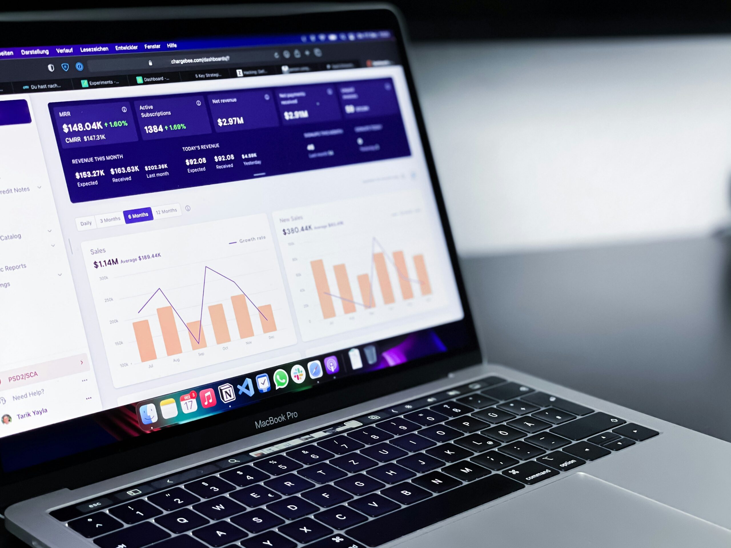
You know how the space is doing. Now you have to explain it.
A promotion often changes your relationship with reporting. When you’re close to the day-to-day running of a coworking space, you absorb a huge amount simply by doing the job.
You know that Tuesdays are packed. You know meeting room three is constantly booked. You know the private office that has been empty for two months. You know three members cancelled recently and that finance is chasing one large unpaid invoice.
Then you find yourself presenting to leadership. Suddenly, “I know what’s going on” has to come from consistent data, presented in a way other people can understand quickly.
Leadership needs your reliable view of business performance along with enough context to see any changes that matter. Your operations team may look at dozens of numbers during the month, but you leadership report should be much more selective.
A useful starting point is to ask: If leadership only had 20 minutes with this report, what would they need to know to make a sound decision?
Page one should tell them how the business is doing
Someone should be able to read the first page and understand the shape of the period.
That usually means a small group of headline measures covering financial performance, space, demand and members.
Here’s a good and simple example.
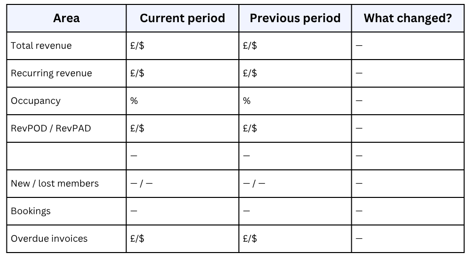
The exact measures will depend on your business. A private-office-heavy operator will care about a slightly different mix from a workspace built around hot desks and meeting rooms.
You’ll know the mix, just make sure page one shows overall performance and points towards areas worth discussing.
Comparison is important here.
“Occupancy is 82%” gives you a number. “Occupancy has fallen from 87% to 82% over the past three months” gives you something to investigate.
A longer trend can be useful too. Comparing the current month or quarter with the previous period tells you what moved recently. Looking across six or twelve months can show whether that movement is part of a wider pattern.
Give leadership the explanation, not another dashboard
This is where many performance packs become too long. A KPI changes and three charts are added. Someone asks a question one month, so another table stays in the report forever. Before long, the pack contains all the noise of everything the business can measure.
Leadership needs the important changes explained. Imagine meeting room revenue fell 9%.
Your report could show a graph of meeting room revenue by day, location, room, product and customer, or say:
Meeting room revenue fell 9% this period. Most of the decline came from Friday bookings, while Monday to Thursday remained broadly stable. The team will review Friday demand and pricing before the next report.
Now leadership knows what happened, where the movement came from and what is being done. This kind of data storytelling is reliable. Any supporting reports can sit behind that statement if somebody wants to investigate further.
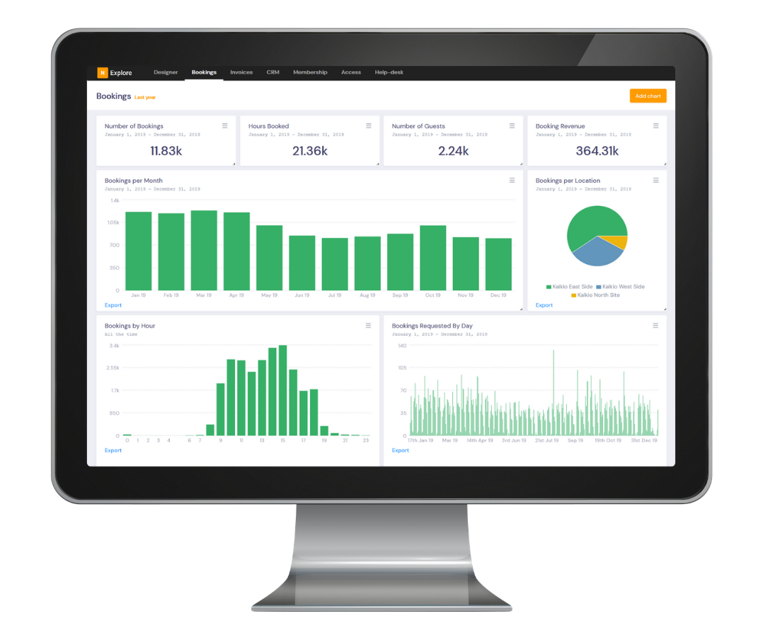
The same approach works across revenue, occupancy, churn, invoices and bookings. Think of the performance report as the edited version of core operational data.
Show financial performance from more than one angle
Revenue will usually be the first thing leadership wants to see. Start with total revenue, then give enough context to show where it came from.
Depending on your model, that might include recurring membership revenue, private offices, meeting rooms, day passes, events, virtual offices, services or other one-off products. Then look at what has happened after the sale.
- How much has been invoiced?
- How much has been paid?
- Are overdue invoices rising?
- Are failed payments becoming more common?
- Have refunds or credits materially affected the period?
If a strong revenue figure sits alongside a growing overdue balance it will change how leadership interprets the month. Never hide the numbers, but show the reasons and suggest how your team can help support the business.
It’s also a good idea to highlight changes in revenue mix. Perhaps overall revenue is flat, but recurring membership revenue has increased while one-off income has fallen, or meeting room revenue is growing faster than membership revenue. Maybe one membership plan is contributing much more than it did six months ago.
Those shifts tell leadership more about the direction of the business than the headline alone. Reveal fluctuations and discuss how you can work with leadership to move into growth areas.

Share how well the space is performing
Occupancy is the obvious place to start, next add utilisation where it helps explain what is happening inside the building. Occupancy shows how much inventory is sold or assigned, while utilisation looks at how bookable space is being used. In a leadership report, the relationship between the two is often more interesting than either number on its own.
You might have strong office occupancy alongside weak meeting room utilisation.You could have a hot-desk area that looks packed every Tuesday morning but still has plenty of unused capacity across the week.
Revenue measures such as RevPOD and RevPAD add another layer by showing how effectively occupied and available desk capacity is producing income.
Again, focus on movement and exceptions. If utilisation has been steady for six months, leadership needs the headline, and if one resource category has fallen sharply, show it.

Use bookings to explain demand
Bookings help show when, where and how people want to use your workspace. Your operations team might regularly look at booking duration, credits, cancellations, tentative bookings, booking customers, no-shows and demand by hour.
Leadership needs patterns that affect a commercial or operational decision, so you can show them things like:
- A sustained increase in meeting room demand
- A period of the week with consistently low utilisation
- Unusually high cancellations
- A resource that is becoming difficult to book
- A resource that rarely gets used
- A change in booking revenue
Your overview might look like this:
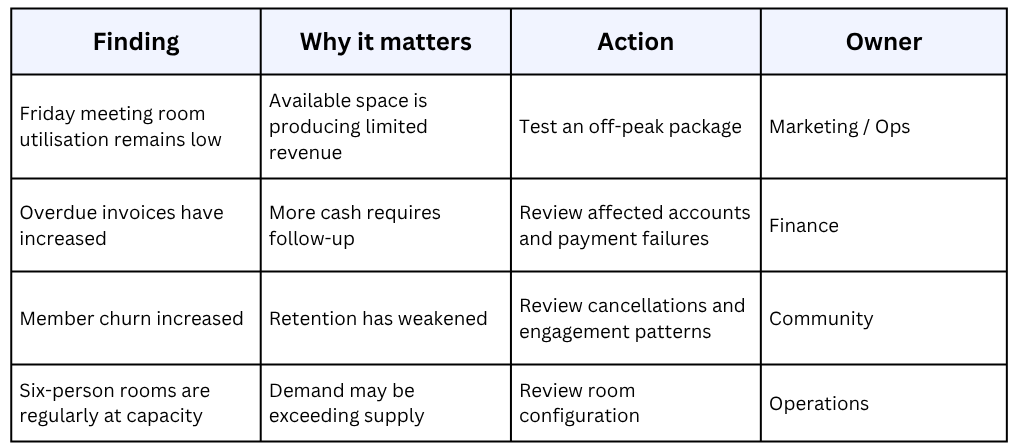
Demand for six-person meeting rooms continues to grow, with weekday mornings regularly reaching capacity. We’ll review whether another room can be reconfigured to meet that demand.
Friday desk bookings have remained below the rest of the week for four consecutive periods. Marketing will test an off-peak offer before the next review.
Now you’re helping everyone understand that bookings are contributing to a business discussion about space, pricing and demand.
Look at retention alongside member growth
New memberships make an easy headline, but leadership should also see what is happening to the members already there.
Bring new members, lost members, active members and churn into the same section. Depending on the maturity of your reporting, you may also include revenue churn, average length of stay, lifetime value or performance by membership plan. The most useful part is often the relationship between those figures, because adding 30 new members but losing 25 deserves attention.
If you want to look at reducing churn, engagement data provides early context. Changes in check-ins, bookings or other member activity can help your team identify groups that may need attention before they leave.

Keep operational detail on a need-to-know basis
Your senior team doesn’t need the daily operating report copied into the performance pack.
Check-ins, support tickets, logins, orders, events and other activity are only useful when they explain a performance metric.
Have your support tickets have increased significantly? Perhaps member check-ins are falling while active membership remains stable? Maybe event attendance has increased alongside stronger engagement.
Include those findings when they add context to the wider story and leave routine operating metrics for the teams who use them every day. This helps keep the leadership report readable and gives operational data more weight when it does appear.
If you run several locations, show the exceptions
A report for a multi-site business needs a portfolio view, but it soon sprawls when every section is repeated for each building. Try using an overall result first, then surface the locations that reveal a meaningful change.
What this might look like:
Portfolio occupancy remained at 84%. Birmingham increased four percentage points, offsetting a five-point fall in Leeds. Leeds has now declined for three consecutive periods and will be reviewed with the local team.
Now you’ve given leadership the portfolio number and the location story behind it. If you keep definitions consistent across the portfolio, comparisons become far more meaningful.
Always end with what happens next
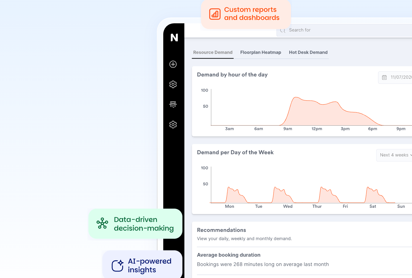
This may be the most useful page in the report. By this point you have shown your leaders the overall results and explained areas worth their attention.
Now turn those findings into actions to define your team’s goals. It really can be as simple as three to five actions. Here’s an example:
Keep the format boringly consistent
Your first leadership report will probably take some work, but if you stay consistent, the third will be easier. Use the same core definitions, reporting periods and sections each time. Your senior team will learn where to find things, and changes become easier to spot.
Try a simple structure like this:
- Performance summary
- Revenue and financial health
- Occupancy and utilisation
- Bookings and demand
- Member growth and retention
- Operational exceptions
- Actions and owners
The story inside each section will change, but if a chart has not prompted a question or decision in six months, you have permission to question whether it still needs to be there.
And of course, if leadership asks for information that is missing, add it and see what it brings to light. Your reporting should evolve with decisions the business is making, and you may not be aware of those yet.
How Nexudus Explore can support the reporting process
If your coworking data already sits in Nexudus, Explore gives you a clearer reporting layer for bringing this information together.
For a leadership report, you can start with the high-level view across revenue, occupancy, RevPOD and RevPAD, customers, memberships, bookings and invoice performance.
If something needs explaining, move into the detail behind it. Finance can investigate revenue and invoices, operations can look more closely at bookings and space usage, and membership and retention reporting can add context around growth and churn.
Explore also lets teams work with fixed reporting periods, drill into data, export reports and schedule reports for delivery by email. For more advanced reporting needs, Explore Pro adds custom report building and the ability to create and save dashboards.
That means the leadership team can stay focused on the summary, while the people closest to each area can investigate what sits behind the numbers.
Want to know more about
how Nexudus could help your business?
We’re here to answer any questions you have.
Latest articles
-

- Coworking
- Technology
Nexudus AI Agents: The Different Types and What They Do
Emily Nguyen on October 12, 2026 -

- Coworking
- Coworking Resources
Practical AI Lessons for Coworking Operators from GWA Denver 2026
Damian on October 1, 2026 -

- Coworking
- Coworking News
- Technology
AI didn’t add a feature to coworking software. It’s rewriting what the product is.
Jane Robathan on September 30, 2026