Coworking
-

- Coworking
- Coworking Resources
- Hybrid work
How to Launch Fractional Offices in Your Coworking Space
Kate Tattersfield on March 25, 2026 -
- Coworking
- Coworking Resources
- Hybrid work
What are Fractional Offices? A Guide to Selling Hybrid Office Space
Emily Nguyen on March 23, 2026 -

- Coworking
- Coworking Resources
AI in Coworking: How AI is Transforming Operations and Member Experiences
Emily Nguyen on March 20, 2026 -

- Coworking
- Technology
Best Meeting Room Booking Systems for Flexible Workspaces: 2026 Comparison
Jane Robathan on March 13, 2026 -

- Community
- Coworking
Coworking Onboarding Email Templates and Sequences
Kate Tattersfield on March 10, 2026 -

- Coworking
Stop Selling Desks. Consistency Is Coworking’s Real Differentiator
Kate Tattersfield on March 5, 2026 -

- Coworking
- Coworking Resources
The Subtle Strains Undermining Coworking Experience
Lucy McInally on February 27, 2026 -

- Coworking
- Technology
Why Your Coworking Experience Breaks (It’s Operational, Not Cultural)
Kate Tattersfield on February 26, 2026 -

- Coworking
- Coworking Resources
Farewell Flat Pricing – Dynamic Pricing Has Staying Power
Kate Tattersfield on February 18, 2026 -

- Coworking
- Coworking Resources
Why Coworking Members Leave (Did You Miss These Signals ?)
Kate Tattersfield on February 11, 2026 -

- Community
- Coworking
- Coworking Resources
What “Community” Means in Coworking (and Why Most Spaces Get It Wrong)
Kate Tattersfield on February 6, 2026

Fractional offices are becoming the go-to workspace solution for hybrid working.
With the days of businesses requiring a permanent 5-day a week office swiftly slipping by, there’s a growing appetite for shared access to private office space. Coworking in an open space isn’t for everyone, and fractional offices bridge the gap between privacy and flexibility.
For coworking operators, the rise of fractional office rental creates a lucrative opportunity. In making room for offices that facilitate hybrid working for the organisations or individuals who need their own space, you can appeal to a much wider audience of coworkers.
And adding fractional office membership to your roster is easier than you might think.
Identify offices that can be converted into fractional offices
The first step towards launching fractional offices is to pinpoint the private offices within your space that lend themselves to this model. Not every space is going to be a good fit.
For instance, some offices might already be occupied by long-term tenants. Others might be designed for large, full-time teams, and as such aren’t suitable for flexible usage.
Focus on offices that are vacant, harder to fill, or are underused on specific days of the week. Offices that accommodate smaller teams of between two and six people are ideal, as are offices located in quieter areas (the to-ing and fro-ing won’t disturb others).
You might want to start small by testing one or two fractional offices. This will allow you to gauge demand and optimise the fractional member experience before you scale the offering across your space or wider coworking space portfolio.
As with everything in coworking, clarity is crucial.
Predictable availability maximises occupancy.
Clearly define which days members can access their fractional office. For instance, you might allow team A to book set days of the week, such as Tuesdays and Thursdays, and team B Mondays and Wednesdays. Fridays might be reserved for ‘hotdesking’ across both.
Establishing clear scheduling policies is also important; fair usage rules help maintain balance. Members should use your booking system to reserve their allocated days in advance, and understand the policies around cancellations. Set expectations around shared resources to help ensure all users have equitable access.

Furnishing a fractional office
Good fractional office design is led by a combination of comfort, balance and flexibility. It’s about making the space work for everyone who uses it.
In terms of a colour scheme, opt for neutral tones to create a calm and professional environment that speaks to a variety of tastes. Bold tones don’t appeal to everyone: they can be distracting and may also clash with some occupiers’ brand colours.
Soft and muted tones like ivory and taupe reduce visual noise, making it easier for people to concentrate in shared environments.
Choose modular furniture that can be easily rearranged. Moveable partitions can be used to create temporary meeting rooms or private areas, while stackable chairs are easy to store when not in use. Mobile pedestal drawers enable members to move their storage between desks, and height adjustable desks are required for the comfort of rotating users.
Adding a few indoor plants or a couple of pieces of artwork can add some personality to the space – both add interest without being intrusive. Fractional offices, because they’re intentionally unbranded, risk feeling impersonal – adding greenery and a splash of vibrancy can make the environment feel calmer, welcoming and more human.
Set pricing for shared office space access
If pricing fractional offices sends your head into a spin: never fear. It’s actually simpler than you think. Generally, fractional office members should pay less than full-time office members – but you should still earn more revenue from the space overall.
Fractional members are getting access to their own private space, so can expect to pay more than a coworking or hotdesking member would for the equivalent number of days or hours.
Ultimately, businesses are often willing to pay for predictable access to a professional workspace without committing to a traditional office lease. A common approach to fractional office pricing is to cost based on a percentage of the full-time office rate.
For example:
- A two-day-per-week office membership might cost 40–50% of the full office price
- A three-day membership might cost 60–70% of the full rate
- A 10-day a month membership might sit somewhere between the two
It can be pretty lucrative if the demand and logistics work out. This pricing model allows you to provide office space for hybrid working while maximising revenue from the space.
Like coworking memberships, bill fractional offices on a monthly basis.
Monthly billing aligns with how many small businesses budget; it creates predictable recurring revenue for you and a predictable cash flow pattern for them. In short, it simplifies operations, while positioning the offering as a flexible alternative to a traditional lease.

Define access rules for businesses sharing sharing an office
When multiple companies are sharing an office, clear access rules are essential. Without a structured system, scheduling conflicts or unclear expectations can quickly create problems.
1. Assign fixed office days
Keep things straightforward by assigning specific days of the week to each business using the office. For example, company A uses it on Mondays and Tuesdays, company B uses it on Wednesdays and Thursdays, and company C calls it home on Fridays.
This level of predictability ensures each team knows exactly when the office is available.
2. Establish workspace guidelines
Members sharing the same office should also follow a few basic workspace guidelines. These help ensure the next team can use the office without disruption.
Guidelines might include:
- Clearing desks at the end of their booking
- Removing personal belongings
- Resetting furniture layouts if they were changed
When these rules are clear from the beginning, businesses will feel more comfortable using fractional offices as a reliable hybrid working office space.
3. Consider storage solutions
Some spaces provide lockers or small storage areas for members who regularly use fractional offices, enabling them to leave equipment or materials onsite without cluttering the shared workspace. This can also help create a stronger sense of place and ‘ownership’.

Set up booking and scheduling systems
The more businesses involved, the more complicated things could get.
That’s why most coworking operators rely on workspace management platforms to handle bookings and scheduling. As fractional offices grow in popularity, having the right scheduling infrastructure becomes essential for delivering a seamless hybrid office space experience.
Your online booking system allows members to see when offices are available and reserve their time in advance. It makes it easier for businesses to plan collaboration days, while giving operators full visibility over how the office is being used.
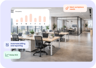
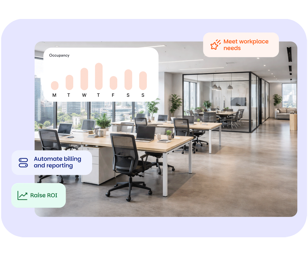
Workspace management software like Nexudus simplifies the booking process by combining bookings, access control, and membership management in one platform. Operators can assign office access and entry rules based on membership plans, automate scheduling rules, and track how frequently offices are being used (then use this data for strategic decisions).
Booking and scheduling systems help reduce administrative work for community managers. Instead of manually coordinating office schedules in a spreadsheet, the system handles bookings automatically and prevents double reservations.
Market fractional offices to hybrid teams and startups
So, your fractional hybrid working office spaces are configured and priced – and you’ve got the booking system. Now, you need to source the members who’ll actually inhabit them. .
Lots of businesses are already looking for hybrid office spaces, but they may not immediately recognise fractional offices as the solution they need. Although the concept of a shared private office isn’t new, the term ‘fractional office’ only entered the work lexicon recently.
Clear messaging can help bridge any gaps.
Start by highlighting the flexibility that fractional offices provide.
Businesses can access a private office when they need it without committing to a long-term lease or contract. For hybrid teams that only meet in person occasionally, this type of office space for hybrid working can be far more practical than renting a full-time office.
Startups are often an ideal audience for fractional offices.
Early-stage companies frequently want a professional environment where their team can collaborate and meet clients, but they may not yet need a dedicated office every day.
Remote-first companies are another strong fit.
These teams operate from home most of the time but still want a place to gather for planning sessions or team meetings every so often – perhaps once a week or a few days a month.
By positioning fractional offices as flexible hybrid working office space, you can attract businesses that might not otherwise consider renting a private office.

Monitor usage and optimise your fractional office offering
Launching fractional offices is just the beginning of the journey.
As more members start signing up to fractional office memberships, it’s important to track how the model performs through your analytics tool, and make adjustments over time.
Start by monitoring office occupancy rates. If certain offices are frequently booked while others remain empty, you may want to adjust pricing or availability to balance demand. Consider design too – could a different layout orientation work better, for instance?
It’s also useful to look at booking patterns. For example, some coworking spaces find that demand is higher on certain days of the week, especially midweek when hybrid teams tend to gather in the office. You might decide to offer discounts on Mondays and Fridays.
Member feedback can also provide valuable insights.
Businesses using fractional offices may have suggestions about scheduling, storage, or membership options that could improve the experience. Over time, these adjustments help refine the model and ensure that fractional offices remain a valuable revenue stream.